Create a Heatmap in Engage

What is a Heatmap?
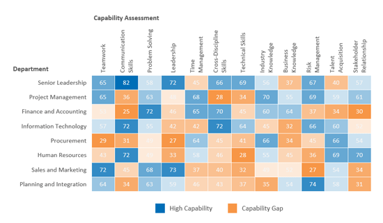
A heatmap organizes the data in a matrix format with each data cell represented by color. Typically a heatmap with one color will show the higher values with darker color and lower values as lighter color.
Example
Imagine that you've just completed a skills assessment by department in an effort to identify and close skills gaps in your organization.
The column charts show how well each department scored on their capabilities assessment. A high score corresponds to high capability and a low score corresponds to a capability gap.
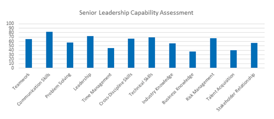
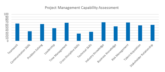
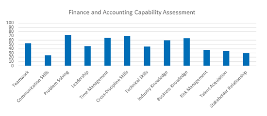
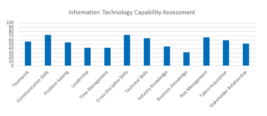
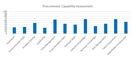
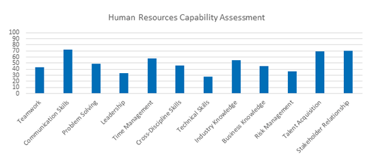
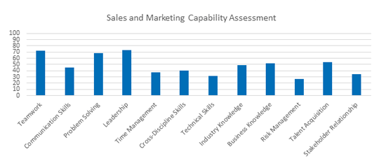
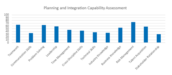
The column charts clearly show the results of the skills assessment but were you able to quickly identify the areas in which each department will need to focus on in order to close their skills gap? It's not easy since there's multiple charts you need to go through. It would be much easier if you could combine all the same information from above in one chart.
Adding a Heatmap Chart

With the heatmap chart, people can more clearly see the areas where they scored very well in their capability assessment and the areas where they scored low and will need to close those gaps. Here we can clearly see that senior leadership have high capability (blue boxes) across multiple areas namely communication skills and leadership but will need to improve business knowledge and talent acquisition (orange boxes) and that other departments like procurement will have more work to do to close their capability gaps.
We can also add the values for each cell in the heatmap to show the assessment results if we want.