Create a Waterfall Chart in Engage
Video not loading? Try it on 
What is a Waterfall Chart?
The waterfall chart shows how an initial value is affected by a series of intermediate positive or negative values to arrive at a final value.
Example
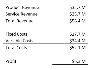
Imagine that you're trying to show the different positive and negative components which result in company profit like in the table below.
The waterfall chart makes it easy for your audience to visualize and interpret the different components and their effect on the total value.
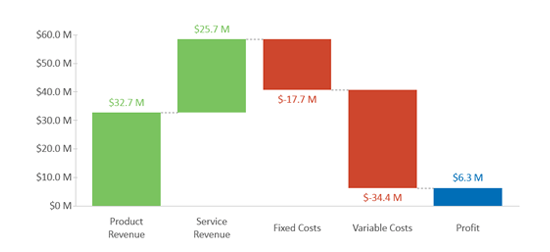
With the waterfall chart above, people can see both the breakdown and impact that product revenue, service revenue, fixed costs and variable costs have on profit.
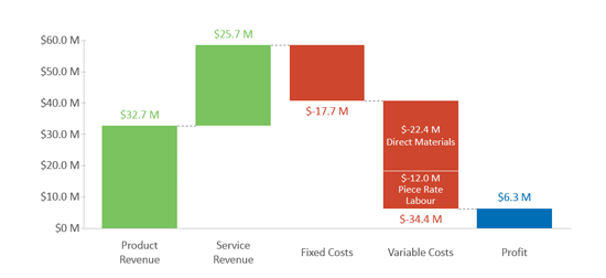
We can also add additional details by adding columns or stacks like in the example below where we show the breakdown of variable costs.
Still can't find your answer? Email us