Create a Connected Stacked Chart in Engage

What is a Connected Stacked Chart?
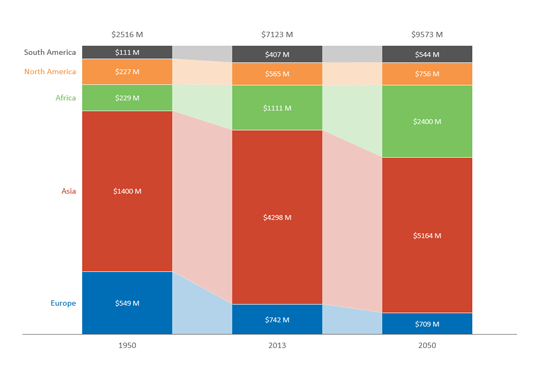
The connected stacked chart shows the breakdown of different components within a column and visually connects those components across multiple columns.
Example
Imagine that you're trying to show how the economies of different regions have changed over time. In addition to showing the relative size of each component within each column, the connected stacked chart also makes it easy to follow the changes of those components from column to column.
In the chart above, it's clear to see how out of all the regions, the Asian economies experienced the most economic growth from 1950 to 2013.
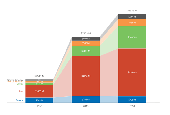
One variation of this chart is the 100% Connected Stacked Chart. What is useful with this chart, as shown below, is being able show the percentage that each region contributes to the total. We can see that even though a region's economies might grow, their relative size to the total might actually shrink if other regions grow at a higher rate. In the last column, we see that even though the Asian economies are projected to keep growing in 2050, their percentage actually shrinks only because the African economies are projected to grow at a much higher rate.