Create a Doughnut Chart in Engage
Video not loading? Try it on 
What is a Doughnut Chart?
A doughnut chart is a circular graphic that represents a percentage value.
Example
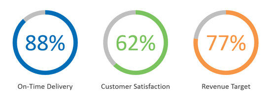
The following table shows the percentage values for three key performance indicators.
| Key Performance Indicator | Value |
|---|---|
| On-Time Delivery | 88% |
| Customer Satisfaction | 62% |
| Revenue Target | 77% |
Adding a Doughnut Chart
Adding a doughnut chart helps viewers better visualize the percentage values you want to present.
Still can't find your answer? Email us