Create a Circular Bar Chart in Engage

What is a Circular Bar Chart?
A circular bar chart has rectangular bars that originate from a central point and go in different directions with lengths proportional to the values that they represent. At the end of each bar, there is circle which also varies in size and color depending on the values that they represent.
Example
Imagine a hotel in New York City that wants to show the total number of guests and associated revenue based on the top 5 cities where those guests have travelled from. The following is a breakdown in table format of that information.
| City | Distance from city to hotel in NYC | Number of Guests | Total Revenue |
|---|---|---|---|
| London | 5,576 km | 8,300 | $835,400 |
| Los Angeles | 3,940 km | 3,900 | $319,800 |
| Paris | 5,844 km | 4,500 | $414,900 |
| Chicago | 1,146 km | 2,700 | $244,700 |
| Hong Kong | 12,962 km | 3,600 | $644,700 |
Adding a Circular Bar Chart
Adding a circular bar chart helps viewers better visualize three dimensions of data especially if the first dimension relates in some way to the difference in distance for each value.
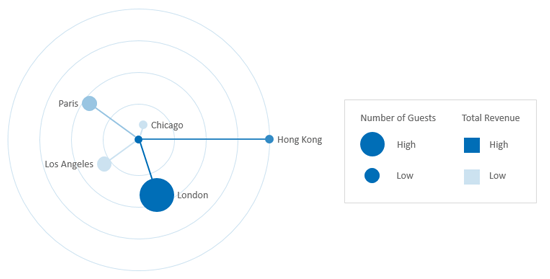
We can see from the size of the circle in the chart above that London represents the most popular city for guests staying at the New York hotel. Based on the color, we can see that guest from London and Hong Kong also contributed the most annual revenue. From the chart above, we can also see the relative distance that guests from each city had to travel to stay at the hotel in New York City. Guests from London and Paris travelled relatively from the same distance while guests from Hong Kong travelled twice that distance.