Create a Proportional Area Chart in Engage
Video not loading? Try it on 
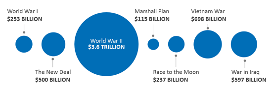
What is a Proportional Area Chart?
A proportional area chart is a series of shapes with area fill space which is proportional to each other.
Example
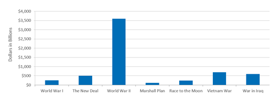
The following bar chart shows how much the US government spent on different major expenditures using inflation adjusted dollar amounts.
Adding a Proportional Area Chart
Adding a proportional area chart like the one below can help viewers better see the differences between the values being presented.
Still can't find your answer? Email us